Wednesday, 22 August 2012
Monday, 11 June 2012
Doc/Fest Typographic Image
Here is a typographic image I have been working on in Photoshop. The idea was to have loads of words that all together describe what a documentary is, AND what the Festival is itself. By using different fonts and sizes I thought this gave it a good eclectic visual appeal and by doing this I made some words stand out more than others.
Sunday, 10 June 2012
Sheff Doc/Fest
A vector image I've been working on in illustrator which can be featured on Festival program or posters/ad shells etc.
This ideas was first a hand drawn sketch of mine, I then scanned it into my laptop and started adding the outline to it in Illustrator. I tried to use different line weights in order to show the different parts of the sketch and also to show which objects were closer than others.
Doc Fest logo development:
From initial sketches and ideas,
To my final logo, I decided to keep it very simple therefore the artwork within the campaign could be more detailed. The logo has two elements, SDF the initials of Sheffield Doc/Fest and the year '12 for 2012 which allows it to stand out from the previous years that this Festival has been around for.
Font: Arial
Style: Regular
Main color: Black
Element color: Pantone 214 EC
Each letter should join the letter below it at a certain point, below I will show the guidelines for this.
Wednesday, 28 March 2012
Are You Product Loyal? (Advertising Essay)
I first tried Jack Daniels a few years ago at my friends' house party, and have loved it ever since. I actually don't like any other Whiskey, but I think that JD in particular has a slightly different taste. Since being 18 and being 'legal' to drink, I have always ordered 'Double JD and Cokes' on a night out, I think of them as being my signature drink (all my friends even knew what 'birthday drink' to buy me this year when we went out in Nottingham).
My obsession over the years has grown, and I have a collection of Jack Daniels merchandise which is continuing to grow also. Some of the pieces of JD merchandise that I have collected are:
- Glasses - Posters
- Drinks Stirrers - Ice Tray
- Recipe Book - Bottle Opener
- BBQ sauce - T-Shirt
I even keep all of my empty bottles of JD, as I have all different sized ones that I line up on the shelf in my bedroom, almost like ornaments that remind me of messy nights out. I'm not exactly sure what it is about the brand that attracts me to it so much. I love the 'black and white' brand identity, and the fact that it has a 'vintage', 'old fashioned' aura about it - although it is becoming an increasingly popular young person's drink. When I went to Leeds Festival a few years ago, I even saw a lot of young girls wearing Jack Daniels T-shirts, some were clearly under 18, which gives the impression they may be wearing it as a brand name, rather than for the fact that they actually like the drink itself. These girls must have somewhere down the line thought that it was 'fashionable' to wear the brand, and for this reason Jack Daniels will always be a big name because its Merchandise is also selling well.
I especially like their 'Happy Holidays' Christmas 2011 ad campaign, where the bottle gets wrapped up as a present at the end, again I like the consistent black and white theme that they apply to their brand.
In this case, as you can probably already tell - I am extremely product loyal, and I think that this will always be a favorite brand name of mine.
Graffiti - Art or Vandalism?
Here are a few examples of what this program could be advertised as, fitting all the features/identity of the '4ward' channel. I created these using Photoshop.
Here is an example of how the program could be advertised during the credits of the program before it:
The other way that the program could be advertised is during advert breaks, where the channel shows a list of shows that will be on during that specific day (almost like a on screen TV Guide). A few examples of how this would look like are shown below:
Graffiti Programme Idea
I thought of another idea for a program series that '4ward' could air, with people such as our tutor Chris in mind who are in this age bracket but do not fit the 'old fashioned' stereotypical ways of an over 60 I have decided it would be good to have a topic based on a debate of art.
Graffiti is either appreciated as 'street art' or is thought of as vandalism by others. Some pieces can be very complex and in my opinion they are really creative and interesting ways of portraying art. Simple 'tags' of people's names on the other hand I believe to be seen as vandalism.
So with this in mind, I went out around Sheffield and took a mixture of photographs, some showing large pieces of 'street art' style graffiti, and others just people who have 'tagged' their name onto the side of a building etc. These photos are shown below as part of my research into this topic:
Monday, 26 March 2012
Love on the Lifeline
A Valentines day special following the story of Kirstie Tantock could be broadcasted on '4ward'. Kirstie is a young girl who had Cystic Fibrosis and desperately needed a lung transplant in order to live, she even got married whilst on the waiting list. She fought all the way til the last minute when she eventually got the transplant she needed. This program can follow her progress since the operation, based on interviews with her and her family and husband to find out what their life is like now she is better.
Scare Fest Campaign - Halloween 2012
For Halloween a series of programs could be broadcasted by 4ward about the very real, very scary yet very interesting true stories of famous serial killers. Below are the images that I have created showing what these advertisements would look like, I think that the close up 'mug shots' make them seem more intense and fit in well with the 'Scare Fest' theme.
Richard Chase - The Vampire of Sacramento.
Chase drank the blood and ate the remains of his victims - he was at large in 1977-1978.
Myra Hindley.
Killed and sexually assaulted children with Ian Brady, in 1960's Manchester.
9/11: In Loving Memory
I have created another Poster using the same consistent style in Photoshop. This one is for a 9/11 two part series that could run in September, starting on the 4th September then ending a week later on September 11th, and the 11 year anniversary of the disaster. This show could feature accounts from the families of the heroes who's lives were taken, stories of the firemen/police that were there on the fateful day but also information about plans to rebuild on Ground Zero.
These images could also be used as Billboard advertisements to increase awareness of the new programs and '4ward' itself to citizens who could catch a glimpse of it whilst passing by.
Titanic Season - Poster
After thinking about possible themes for Seasonal programs, I have used Photoshop to create a poster advertisement for 4ward's Titanic Season that could start on 4th April (10 days before its 100th Anniversary) and show a range of programs including Interviews with the stars of the 1997 Blockbuster, Leonardo DiCaprio, Kate Winslet and even Director James Cameron. There could also be an episode telling the accounts of people who survived the Titanic, and another episode of factual information about the Ship and also video footage from Submersiles visiting the wreck. The episodes could come to a climax on April 14th 2012, EXACTLY 100 years on from the disaster.

The logo should always be positioned in the top right hand corner for poster advertisements, then a black banner should be positioned at the bottom with white text in the foreground in front of it. The program name should always be bold, whereas the date should be standard text - the font for this text is Helvetica Neue and the size is 22pt. I have incorporated the multi-colored squares into the poster by using them as a bottom border - all of these features should be the same within all poster design in order to keep a consistent and flowing style throughout the Advertising campaign.
4ward Over 60's Channel TV/Internet Ident
Using Flash I have created a short Ident for my new channel, 4ward. My idea behind it was to take the game Tetris and include the logo into it somehow, the theory being that games are only played by the 'younger generation' but supporting the concept of my Channel which I have explained previously that Over 60's can 'move forward' into 'the now' by watching this TV channel. I used motion tweens and altered opacity settings to achieve the 'fade in, fade out' effect. I made sure that the timing of this was right, giving the objects/text just enough time to reach the bottom, stay on screen a bit then fade out allowing the 4ward logo to stand out alone. I then brought in the slogan 'Don't get stuck in the past, move 4ward' with the same 'fade in, fade out' effect. I believe although that this is a short Ident that it could convey the message quickly yet effectively.
If I were to edit this Ident I would purchase an MP3 file of the 'Tetris' game sound effects to attach to it, then also maybe add a 'Game Over' soundtrack. I could not find any appropriate free sound effects though so I left it how it is.
Sunday, 25 March 2012
D&AD Intro: Over 60's Channel, 4ward.
I have decided to do the Channel 4 brief for D&AD (to create a new channel for an Over 60's audience), I thought it sounded quite interesting but challenging at the same time to get the right balance of what they wanted (an intelectual channel that is not patronising to this age group).
First I did a brainstorm to try and generate some ideas for the new Channel's name, this is shown below:
The names I thought of were:
- 460°
- Fast Fourward
- 4ward
I then went on to do a few sketches of possible ideas for a logo, these are shown below:
I finally decided to stick with the name '4ward', after doing so I used computer software such as Illustrator to create a logo. In my mind I wanted it to be bright and colourful, also maybe using different shapes within the logo. I also wanted to use the 'fast forward' symbol (the two arrows) within my logo. Below is my final logo, and some information about the Channel, explaining my thoughts at the time.
Tuesday, 6 March 2012
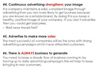
Advertising Presentation: Reasons to Advertise.
This is the title I have been given for my presentation for Paul - 'Reasons to Advertise'. I created a Powerpoint showing the topic I have researched, I found it very interesting and I feel that it has given me a clearer mind for our current D&AD project. I now realise how crucial advertising is for a company, and how it can affect their brand name.
Wednesday, 8 February 2012
My final 'Mode' logo
Below is my finished logo:
I have then tried it in diferent colours, these colours shall be the only variaties of it that will be used, I will further explain this in my Corporate Identity Manual...
I have also done an 'inverse' version of my logo, therefore black background and white text...
Subscribe to:
Comments (Atom)


