Monday, 26 March 2012

4ward Over 60's Channel TV/Internet Ident

Using Flash I have created a short Ident for my new channel, 4ward. My idea behind it was to take the game Tetris and include the logo into it somehow, the theory being that games are only played by the 'younger generation' but supporting the concept of my Channel which I have explained previously that Over 60's can 'move forward' into 'the now' by watching this TV channel. I used motion tweens and altered opacity settings to achieve the 'fade in, fade out' effect. I made sure that the timing of this was right, giving the objects/text just enough time to reach the bottom, stay on screen a bit then fade out allowing the 4ward logo to stand out alone. I then brought in the slogan 'Don't get stuck in the past, move 4ward' with the same 'fade in, fade out' effect. I believe although that this is a short Ident that it could convey the message quickly yet effectively.


If  I were to edit this Ident I would purchase an MP3 file of the 'Tetris' game sound effects to attach to it, then also maybe add a 'Game Over' soundtrack. I could not find any appropriate free sound effects though so I left it how it is.

Sunday, 25 March 2012

D&AD Intro: Over 60's Channel, 4ward.

I have decided to do the Channel 4 brief for D&AD (to create a new channel for an Over 60's audience), I thought it sounded quite interesting but challenging at the same time to get the right balance of what they wanted (an intelectual channel that is not patronising to this age group).

First I did a brainstorm to try and generate some ideas for the new Channel's name, this is shown below:


The names I thought of were:
- 460°
- Fast Fourward
- 4ward

I then went on to do a few sketches of possible ideas for a logo, these are shown below:


I finally decided to stick with the name '4ward', after doing so I used computer software such as Illustrator to create a logo. In my mind I wanted it to be bright and colourful, also maybe using different shapes within the logo. I also wanted to use the 'fast forward' symbol (the two arrows) within my logo. Below is my final logo, and some information about the Channel, explaining my thoughts at the time.


Tuesday, 6 March 2012

Advertising Presentation: Reasons to Advertise.

This is the title I have been given for my presentation for Paul - 'Reasons to Advertise'. I created a Powerpoint showing the topic I have researched, I found it very interesting and I feel that it has given me a clearer mind for our current D&AD project. I now realise how crucial advertising is for a company, and how it can affect their brand name.


Wednesday, 8 February 2012

My final 'Mode' logo

Below is my finished logo:

I have then tried it in diferent colours, these colours shall be the only variaties of it that will be used, I will further explain this in my Corporate Identity Manual...


I have also done an 'inverse' version of my logo, therefore black background and white text...

Logo Ideas


Above are 2 of my initial Ideas for a High Street Fashion/Clothing Store, something similar to current names such as Topshop, New Look and River Island. Both concepts are monotone yet completely different, I believe that my first idea was the best therefore I choose to develop this one further into the finished marque.

Friday, 3 February 2012

Colour Theory: The Colour Wheel.

Colour Theory:

The basic theories behind colours are the different types of colours, and how they are made. The colour wheel below shows each different colour in its own category.


Primary colours, Red, Blue and Yellow cannot be created by combining any other colours.
Secondary colours are what is created when you combine two Primary colours.
Tertiary colours are a mixture of Primary and Secondary colours.

There are also Complimentary colours, which are colours that should work well together. Although not shown under a category on the colour wheel, these all colours that are opposite eachother. For example: Red and Green or Yellow and Violet.


Tints, Hues and Shades:

Colour is a general term, this includes White and Gray. Black is a technically a lacking of colour.


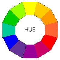
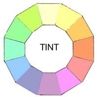
Hues are the purest and brightest forms of the colours displayed on the wheel. Tints, sometimes known as 'Pastels' are colours with White added, therefore diluting them down and making them a lot more 'easy on the eyes'. 'Pastel' colours are a popular choice that are used for such things as decorating childrens' room's (sometimes referred to as baby pink, baby blue).
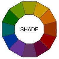
Shades are in theory the opposite of what a Tint accomplishes, they are created by adding black to any colour - therefore darkening it and making it appear a lot 'grungier' looking.

Tones are a combination of both Tints and Shades, this is when Black and White are both added to a colour therefore 'greying it down'.

Hues on a Color WheelTints on a Color Wheel
Shades on a Color Wheel

Monday, 9 January 2012

I love this.

I love all the old fashioned vintage style posters with the really smiley ladies, and this slogan especially made me chuckle. I've also got a thing for French vintage posters.. when I get my own place I bet I'll have loads of stuff like this up on my walls.